Back to Home

PRODUCT / IDENTITY / AI · 2026
The portfolio
A distinct identity. A system to sustain it.
This website presents my work and shows how I work. From the first message to Ask Vini, every choice aims to turn complexity into an experience that is clear, recognisable and easy to explore.
Identity with intent
Four principles guide geometry, colour, typography and art direction.
A system in use
Components and editorial rules connect pages, languages and devices.

Ask Vini
A conversation grounded in content, with a defined scope and human review.

ROLE
Product Design, creative direction and content

PERIOD
2026 · ongoing

AUTHORSHIP
Vini Asevedo · AI-assisted implementation
01 / STARTING POINT
Show the thinking.
Make room for the person.
Designing my own portfolio put me on both sides of a decision: I was the person introducing myself and the designer responsible for creating that experience. The challenge was to bring product, systems and conversational work together while preserving the context and particularities of each project.
“Clarity for the complex” made that intent explicit. The phrase connects what I do with how I present my work: organising rules, relationships and choices so another person can understand them. On the website, this means a direct introduction, paths into deeper detail and room to explore the evidence.
The composition needed to support different reading rhythms. Visitors getting to know my profile find my focus and projects at the start. Those interested in a particular decision can follow a case, read an article or ask a question. These different intentions shaped the relationship between presentation, content and conversation.
- 01
Understand quickly
Role, specialities and projects establish context from the start.
- 02
Explore independently
Indexes, evidence and articles let visitors choose where to go deeper.
- 03
Start a conversation
Contact stays close to the content, including within Ask Vini.
02 / PRINCIPLES
It starts with criteria.
Colour follows.
Before choosing colours, I defined four principles in the North Star: intense, intelligent, precise and human. They act as review criteria. A composition can make an impact and still need more room for reading; an interaction can be expressive and still need to make its function clearer.
Intense
Impact without noise.
Contrast, scale and pauses give the message strength. In the opening, large words sit alongside quiet areas; visual presence comes from that relationship.
Focus attention on one main message and reserve space around it.
Intelligent

Relationships that make sense.
The composition helps people understand. Symbols, headings, captions and actions need to establish recognisable relationships between what people see and what they can do.
Use the symbol’s direction to reinforce the action and its next step.
Precise

Intent in every detail.
Geometry, hierarchy and information have defined roles. The same care applies to a shape’s proportions and to explaining what a metric represents.
Preserve the symbol’s construction and keep evidence close to its context.
Human

Clarity with warmth.
One person speaking to another, with room to read. Tone, pauses and the ability to choose a path are part of the experience.
Let people explore independently and keep contact with me close to the content.
03 / LANGUAGE
My name.
A visual language.
The V and A move out of the signature and begin to guide space, reading and action. The same geometric construction takes on different directions while preserving its proportions. An element of my name becomes part of the interface’s vocabulary.
The form repeats.
Meaning follows the action.
Back or reduce
Forward or expand
Reveal or move down
Collapse or move up
Each orientation follows an intention. In links, the gesture points forward; in expandable content, it indicates revealing or collapsing. In the opening, motion gives it presence through 90° turns around its own centre, separated by pauses. Its geometry carries the identity across different functions.
Silence, signal and intervention.
The palette distributes roles. A dark field supports reading; accents create points of attention. Choosing a colour starts with the role it needs to play in the composition.
Charcoal
#121010Reading field
A dark base with warmth that supports contrast.
Warm light
#F2EFE7The voice of content
Light text that occupies the foreground of reading.
Graphite
#343031Planes and boundaries
Separates layers without competing with the content.
Acid lime
#C8FF00Direction for action
Signature, navigation and selected points of emphasis.
Hot red
#D90034Human intervention
Cuts and choices made visible in the composition.
Deep wine
#4B000FDepth and material
Overlays that give substance to the relationship with the image.
Contrast builds the voice.
Three families share the work. The shift between weight, lightness and precision sets the page’s rhythm: first the message, then its relationships, followed by the details that help people find their way.
Roboto Flex
CLARITY
Structure and reading
Weight to assert an idea and legibility to sustain the text throughout the page.
Raleway
for the complex
Pause and relationship
Lightness between typographic masses. Contrast creates breathing room while maintaining continuity.
IBM Plex Mono
01 / EVERY DETAIL
Indexes and context
Focused precision in chapters, labels and supporting information.
04 / ART DIRECTION
The image takes part
in the composition.
Architecture provides material for the identity: structure, scale, lines and tension between solids and voids. In the opening, the Geisel Library photograph takes on a black-and-white treatment. Cropping and overlaid planes become part of the art direction, helping build the field in which the message appears.
The material
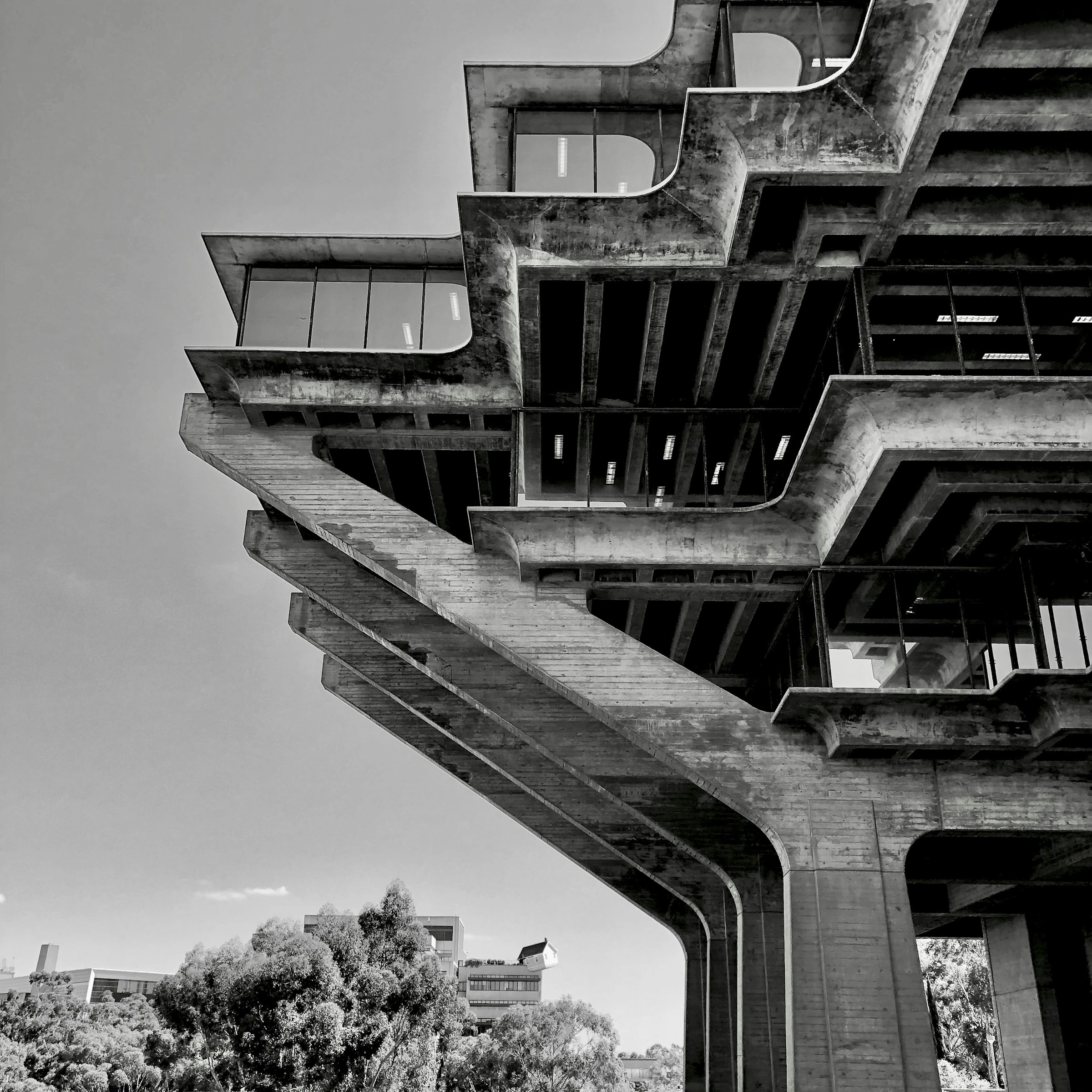
The crop and intervention
Architecture photography used on the Home page: Geisel Library. Arthur / Unsplash.
Black and white at the entrance.
Colour where the project needs it.
In the cases, colour returns to explain the experience. Screens need to preserve the language of the products being presented, and their framing should make them easier to examine. The portfolio’s identity organises the presentation; the project’s interface remains the central evidence.
05 / SYSTEM
From intent
to interface.
A visual decision lasts when it can be reused and reviewed. In Figma, the North Star records intent; foundations, tokens and components make that intent applicable. The system connects a choice of visual language to different pages and interaction states.
The composition changes with the content. A cover introduces an idea; a case connects evidence; an article needs a continuous reading flow. Components maintain recognisable relationships across these situations without requiring every page to tell its story in the same way.
01 / Token
A shared role
The concept documents signal/active: colour takes on a role that can span multiple screens.
02 / Component
A recognisable interaction
The editorial link combines a label, rule and directional symbol. Form, behaviour and states can be reviewed together.
03 / Composition
A distinct narrative
The same pieces organise different pages. The logic remains while content, scale and sequence adapt.
Recompose.
Go beyond scaling down.
The concept defines 12 columns on desktop and four on mobile. Moving between screens reorganises relationships: text receives a readable width, the image takes a different position and actions remain easy to recognise. Scaling everything down proportionally would lose the pauses that give the identity its strength.
Visible focus, contrast and reduced motion belong in the same review. A single interface example is centred on mobile. With a sequence, the carousel maintains left-to-right reading. The rule follows the situation in which it is used.
Documenting, reviewing and versioning are part of design, too. The published experience is the main reference for checking what actually works in the browser. Revisions return to the documentation, and earlier versions are marked as deprecated to preserve the history of decisions.
06 / CONTENT
The story gives
evidence its place.
Each case needs to connect context, research, decisions and consequences. The sequence helps people understand where a choice came from before assessing its final form. An image can show the outcome of a decision; the narrative needs to explain the thinking that made it necessary.
That editing also happens in the details. Metrics sit close to what they measure and the context they cover. One example is the design team’s execution time for off-the-shelf products in the Smarters case: specifying the team and context changes how the number is understood. Icons and comparisons help people navigate the information, while images provide room for inspection.
Articles expand on ideas that appear in the projects and connect them. Portuguese and English are part of the same delivery: content, navigation, images and sharing information need to correspond. Editorial work continues in search and the Ask Vini knowledge base, so new content can also be discovered through conversation.
- 01
Context
What needed to change?
- 02
Investigation
What shaped the understanding of the problem?
- 03
Decision
What did I choose to do, and why?
- 04
Evidence
How does that choice appear in the product?
07 / ASK VINI
Another way
to explore my work.
Not everyone arrives with time to read an entire case. Some people have a specific question about leadership, systems or a project. I created Ask Vini to offer that path: a conversation connected to the content already in the portfolio.
AI with a defined role.
It introduces itself as this portfolio’s AI and helps people explore my background, processes and decisions. The experience uses the site’s visual language, with an informational introduction, suggestions that look actionable and public sources visitors can open.
The conversation follows the same criteria.
The human principle shapes how a question is welcomed and how the experience leads to a conversation with me. Precision shapes the relationship between answers and sources. Visual clarity separates the AI’s introduction from clickable questions. The assistant becomes another expression of the portfolio’s identity and content.
Defining scope was a product decision: Ask Vini consults portfolio content and additional profile information I provide, without browsing external sources. This keeps its answers connected to the work I am presenting. When information is missing, the experience needs to acknowledge that boundary and make room for direct contact.

Content with an origin
Cases, articles and profile information form the knowledge base. New content in Portuguese and English is included when the base is updated. Additional information I provide adds context; displayed references lead to accessible portfolio pages.

Scope and boundaries
The assistant stays within the scope of my work. After three unrelated questions, it politely ends the conversation. Usage limits and unavailability handling are part of the experience; the Beta label signals ongoing development.

Contact at the right moment
After three answers about my work, the conversation can suggest email contact. Visitors can also leave their contact details and a message for me to respond later.
HUMAN IN THE LOOP
Evaluation feeds back into the experience.
Questions and answers from the website reach a review panel. I assess each answer, record what needs to change and, when useful, write a preferred response. The goal is to turn real use into concrete guidance for the next interaction.
- 01
Real conversation
The question, answer and sources are available for review.
- 02
Human judgement
I review accuracy, relevance, tone, language and use of sources.
- 03
Contextual guidance
Evaluations related to a new question help guide the next response.
- 04
Another review
I check whether the guidance improved the response and refine what still needs work.
This cycle improves the guidance given to the assistant. It does not automatically retrain the model: factual claims still depend on the content base.
08 / AUTHORSHIP
Human thinking
behind every choice.
“Human thinking behind every choice” makes my relationship with technology in this project explicit. AI supported construction and accelerated iteration. Art direction, curation, editing and quality criteria stayed under my guidance. My role includes articulating the intent and recognising when a solution still falls short of it.
The process moves between Figma, code and the browser. Figma helps make the intent visible and shareable; the browser shows behaviour with real content, different languages and touch interaction. Review connects the two, refining what a static composition cannot resolve on its own.
- 01
Direct
Define what the portfolio needs to communicate and the criteria that should guide its construction.
- 02
Choose
Compare alternatives with the identity and the task of the person reading.
- 03
Review
Use the published experience to notice gaps in hierarchy, behaviour and language.
- 01Intent in Figma
- 02Implementation
- 03Browser review
- 04Refinement and documentation
Authorship also appears in what I choose to remove. Information can be accurate and still be unhelpful in that part of the story. A shape can attract attention and compete with the message. Judgement means recognising these differences and editing the experience.
09 / EVOLUTION
The detail is
a decision, too.
The portfolio continues to be reviewed in use. Refinements show how principles turn into concrete criteria: what needs to be clearer, what deserves emphasis and what should take up less space. Three decisions make this process visible.
- 01
One example deserves focus
A single interface example is centred on mobile. With multiple examples, the sequence keeps its carousel and left alignment.
- 02
Motion with intent
The symbol rotates around its own centre, pauses for two seconds and rotates again. Touch interaction should not restart it; reduced-motion preferences are respected.
- 03
Information is not a button
Ask Vini’s introduction is presented as text. Suggested questions look actionable, reducing ambiguity between information and something people can click.
Behind the portfolio
The process continues
on the page you are reading.
This page takes part in the process it describes. The identity starts with criteria, takes shape as a system and encounters new questions through use. The work continues in the relationship between what I want to communicate and what another person can understand.